AstroRelay Client (Windows)
Related parties
GL.iNet - AstroRelay
Year
2021
Field
UX/UI
Production Period
21 Days
Background
The AstroRelay Windows Program offers a convenient solution for remote work and device access through a straightforward user interface. This desktop version parallels the functionality of the website alternative, with the added option of a trial version for limited use. In the interests of enhanced cybersecurity, a dual-factor authentication process is incorporated into the log-in mechanism. The website design system adopts a consistent visual scheme, including consistent color palettes, icons, and font styles (Open Sans). The title text is presented in bold typeface, while content is presented in regular form. The main button adopts a filled blue color, while the secondary button employs an outlined white style.
Prototype
After engaging in a detailed discussion with the product manager, I was able to draft a user flow based on the prototype that he had planned. This user flow outlines the various steps that a user would take when interacting with the product, from the initial landing page through to the completion of specific tasks or objectives. By mapping out this flow, we can identify potential pain points or areas for improvement, and make informed decisions regarding the most effective design and functionality choices moving forward. With this user flow in place, we can further refine and optimize the user experience, ensuring that our product is intuitive, engaging, and effective.
Draft
Based on the website version, I am striving to maintain consistency with the website version by utilizing the same design elements and visual style. This includes incorporating the same color palettes, font styles, and icons, as well as replicating the bold style for titles and regular style for content. Additionally, I am ensuring that the main button adopts the same filled blue color, while the secondary button is outlined in white. By matching the same style as the website version, we can create a sense of continuity and familiarity for users, which can help to enhance their overall experience and engagement with the product.
Finalized
Login Page
The login page is the initial point of entry for users. Users can enter their login credentials and receive a verification code via email or SMS to complete the login process.
Welcome Page
Once users have successfully logged in, they are redirected to the welcome page. Users can access various options and features from this page, including the ability to create new links or access existing ones.
Setup Page
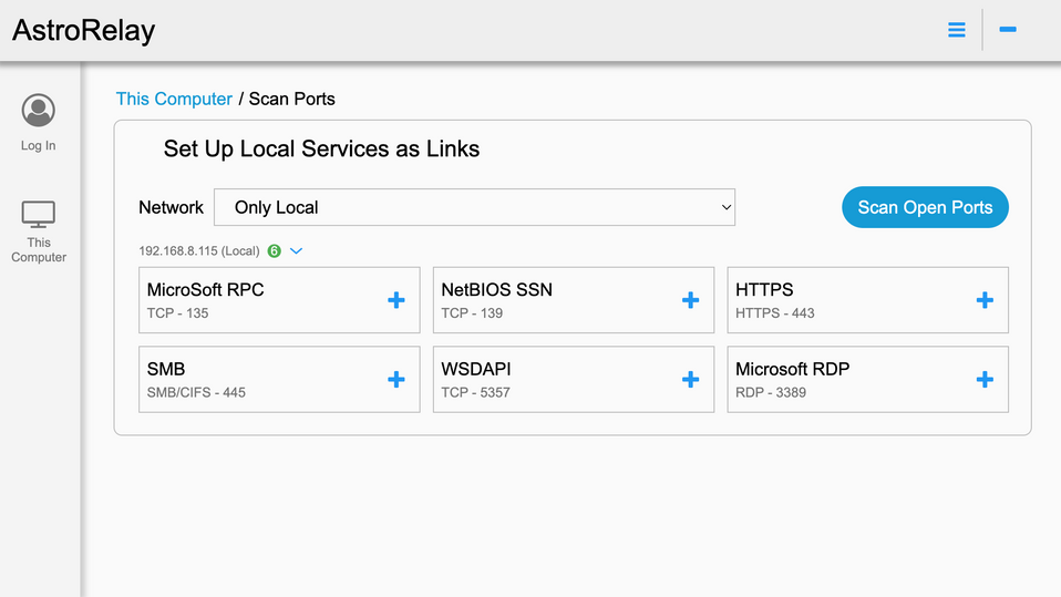
The page adopts the same design elements as the other interfaces, including consistent font styles and color palettes. Users can easily navigate between steps and access additional resources and tools to help them complete their links effectively.
Dashboard Page
The dashboard page provides users with an overview of their account and activity. Users can view their links status, access recent activity, and customize their settings from this page.


